Cloudinary is an AI-based platform for optimizing, transforming, and delivering images and videos. Cloudinary's main products allow anyone to modify images and videos on the fly through urls. Cloudinary's DAM, Image, and Video platform have a breath of AI features that allow enterprise companies to automate and work faster.
As Cloudinary expanded into the enterprise market, I collaborated closely with content, product, and GTM teams to redefine how we told our story—translating complex technical capabilities into a cohesive enterprise narrative and building a scalable system of messaging and creative assets to support growth.
Cloudinary had outgrown its developer-first positioning. As the product scaled into the enterprise, the challenge wasn’t creativity — it was clarity. I led a narrative shift with our content team to help the company show up like the enterprise platform it had already become, translating complex technical value into a story that resonated with both engineers and buyers.
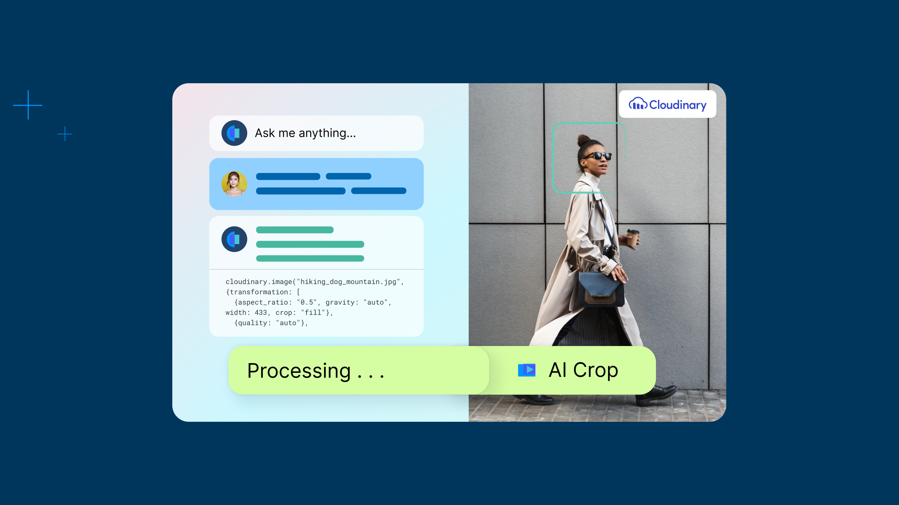
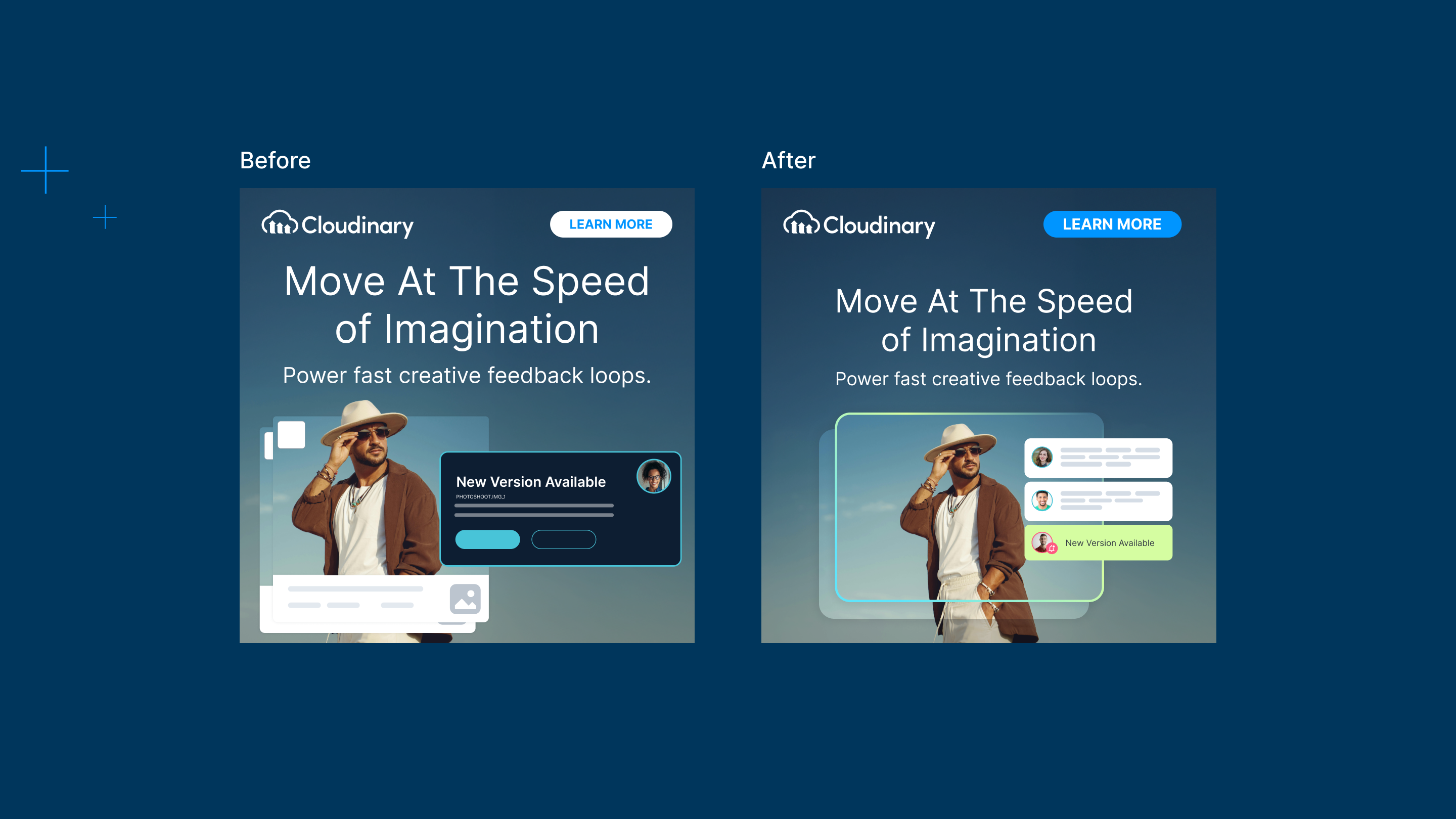
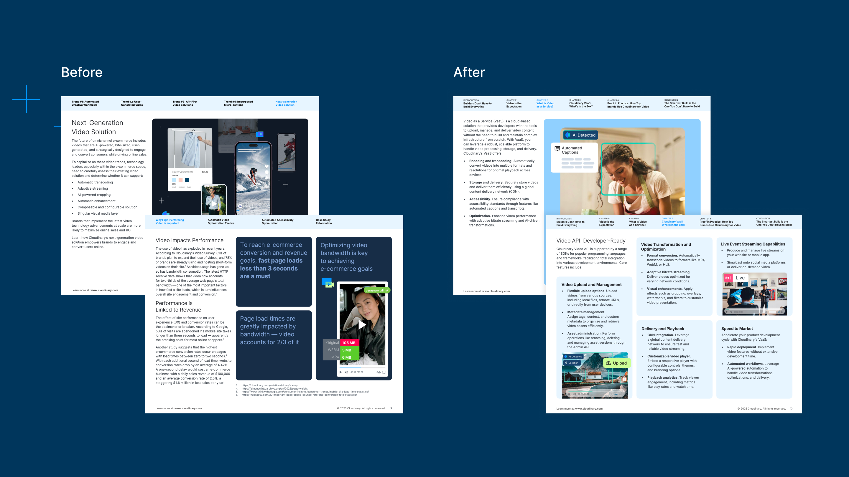
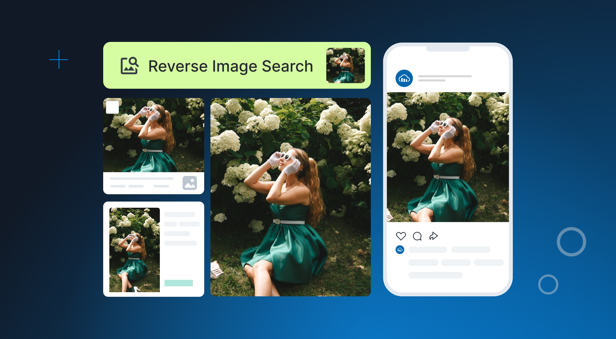
Visually, I simplified Cloudinary's product abstractions to match this new messaging style. This style can be seen across all of Cloudinary's assets- website graphics, social media posts, Linkedin and display ads, as well as videos.
This refined visual direction will grab attention and focus viewers on what truly sets Cloudinary’s products apart. This direction simplifies graphics to clear the noise for a viewer. While at the same time using Cloudinary's brighter secondary palette to grab attention. By leaning more into Cloudinary’s brighter secondary palette within the existing brand system, we can connect with a broader audience. At the same time, simplifying our graphics will create a cleaner, more memorable visual impression.
Product abstractions are an easy way to tell multiple stories for Cloudinary's complex product offerings.
Focus: Helps guide a viewer on what is important rather than getting lost in the details.
Flexibility: Creates a scalable and flexible style that resonates with multiple viewers.
Impact: Evokes stronger emotional connections and leaves a lasting impression.